Brand Resources
Official logos, colors, and typography for representing the Tokenized Asset Coalition
Logo Kit
Download

Suggested usage
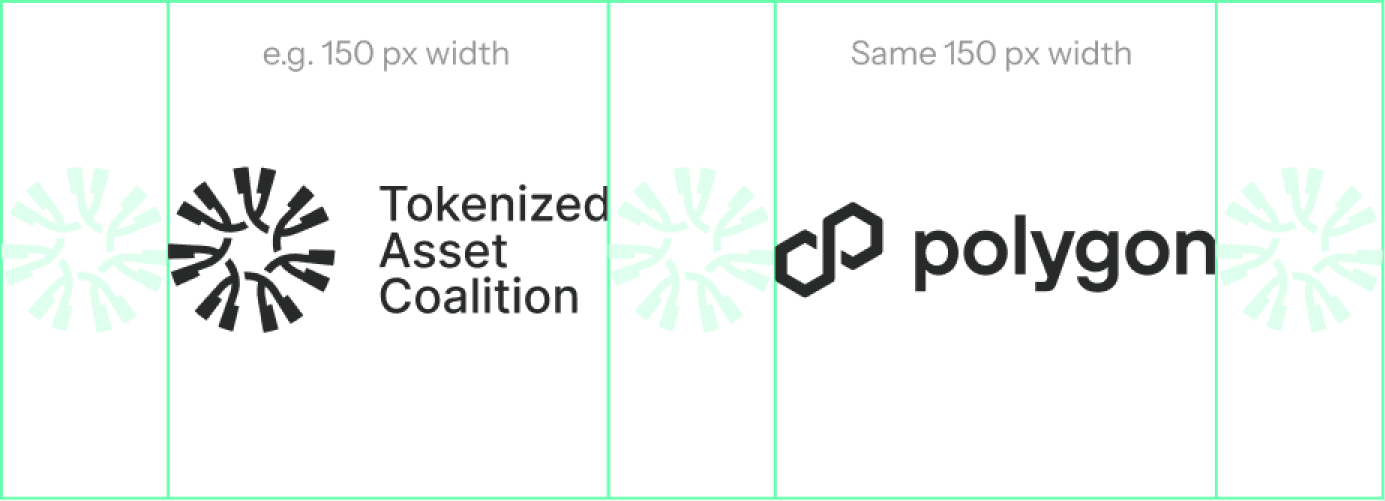
Partner Lockups
Please ensure that each partner lockup has the equivalent 'TAC Symbol' spacing around each logo. The two (or more) logos used next to TAC must be the same X width, or where not possible (i.e. when using vertical logo), a 1:1 ratio.
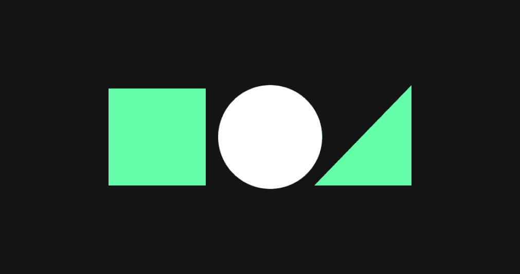
Do not colourize the logo.
Do not replace the composition.
Colors
TAC Mint
#64FEAB
Our primary color is applied on black surfaces to highlight key visuals or headlines.
TAC Dark
#141414
Our primary background color is used in combination with the TAC Mint color as a dark surface, or as the main color for typography on white surfaces.
TAC Gray
#F7F8F7
Our secondary color is used on white surfaces and for secondary text or card backgrounds.
TAC Light
#FFFFFF
Our primary background color is used in combination with the TAC Dark color. It is mainly used for everything except the Join Membership area.
Suggested usage
Please use the TAC Mint only on dark backgrounds.
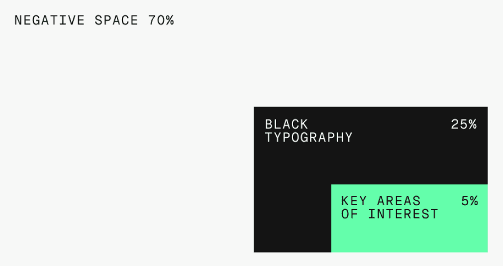
Negative space should take up the majority of layout.
Fonts
Instrument Sans
The medium weight is used for primary headlines. The regular weight is used for body text. It is a free open-source font available on Google Fonts.
Go to Instrument Sans
Geist Mono
It is mainly used for links and captions for the numbers we provide. It is a free open-source font available on Google Fonts.
Go to Geist MonoLogo License Terms
Use of the TAC logo is subject to our license terms. Members must review and agree to these terms before using TAC brand assets.
View Logo License Terms